
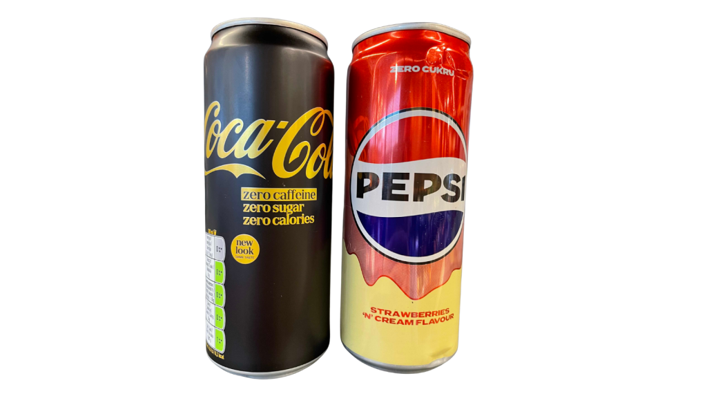
Two cans. One shelf. The same week.
On the left: Coca-Cola Zero Caffeine, in black and gold, with the message “new look, same taste”.
On the right: Pepsi Strawberries ‘n’ Cream, pink and yellow, but with red as the dominant colour.
At first glance, these are simply two flavour or product variants in the cola category. But from a brand strategy perspective, something much more interesting is happening.
For decades, Coca-Cola built one of the strongest colour codes in marketing history around red. Pepsi, in turn, built its visual code around blue, partly to create a clear contrast with Coca-Cola’s red.
And now Coca-Cola is moving into black and gold, while Pepsi is showing a can where blue is reduced to a small part of the logo. Red dominates.
This is not just a graphic detail. It is a useful starting point for a broader question: when can a brand afford to break its own visual codes?
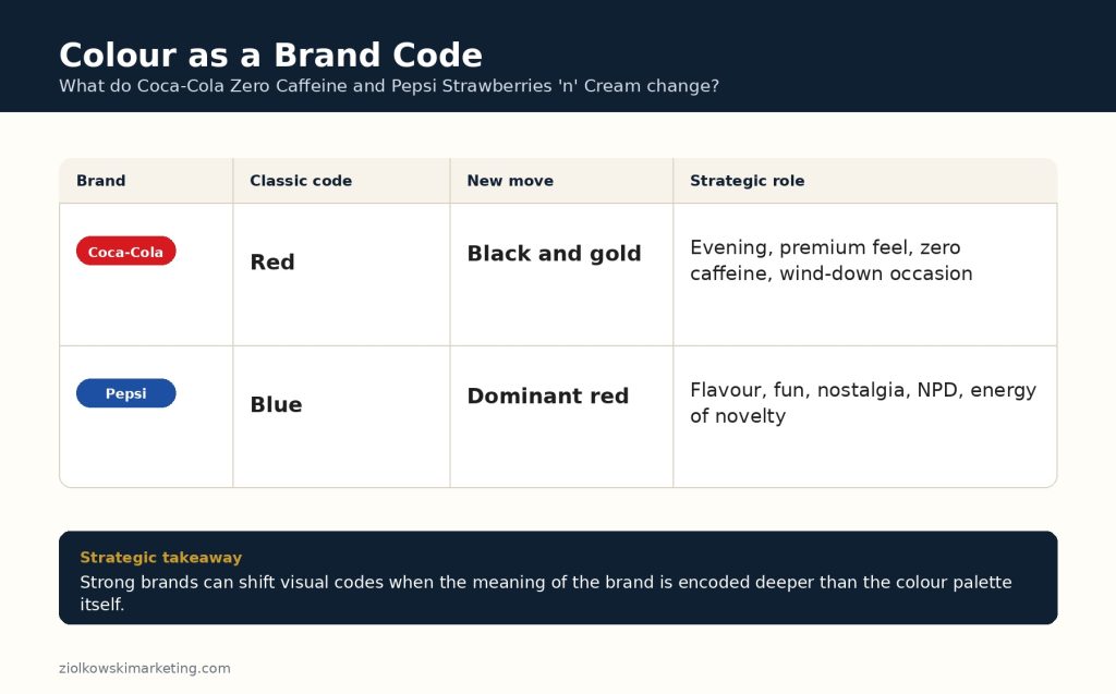
Colour as a Brand Code
In FMCG, colour is not decoration. It is a shortcut in memory.
On a crowded shelf, consumers rarely analyse every element of packaging. More often, they recognise a brand through a handful of signals: colour, shape, logo, layout, typography, packaging material or a distinctive visual asset.
For Coca-Cola, red has long been one of the brand’s most important assets. It has appeared on packaging, in advertising, on fridges, umbrellas, Christmas trucks and across the entire visual world of the brand.
Pepsi built much of its distinctiveness through blue. In the great Coca-Cola versus Pepsi rivalry, colour was one of the simplest ways to encode the difference: Coca-Cola was red, Pepsi was blue.
That is why every moment when these brands move away from their core codes is strategically interesting.
What Has Actually Changed?
Coca-Cola Zero Caffeine Zero Sugar has been relaunched in Great Britain with a black and gold pack design. According to trade media reports, the new design is intended to position the product as a more evening-oriented and premium option: for dinner, post-work moments, winding down and caffeine-free consumption. The relaunch has also been supported by a campaign linked to the 007 First Light game, as reported by Scottish Grocer and Retail Gazette.
This makes strategic sense. Coca-Cola’s red carries energy, classic refreshment and instant recognition. Black and gold create a very different world: more premium, calmer, more evening-led.
Pepsi, meanwhile, is developing flavour variants inspired by desserts and nostalgia. According to The Grocer, citing Worldpanel research, Pepsi Strawberries ‘n’ Cream and Cream Soda generated a combined £2.2m in additional value for the UK cola category and became the fifth most effective product innovation, or NPD, in 2025.
Here too, the logic is clear. Pepsi wants to build associations with youth, fun, novelty, flavour and experimentation. The packaging is designed to shout from the shelf: “this is not just another cola”.
The problem, or rather the strategically interesting paradox, is that in this case Pepsi is doing it through a colour that has historically belonged to Coca-Cola.
Why Can These Brands Afford It?
In my view, because they are no longer prisoners of a single identity element.
Coca-Cola is not just the colour red. Pepsi is not just the colour blue.
Coca-Cola stands for classic refreshment, joy, continuity, shared moments and global recognition. Pepsi stands for youth, change, energy, pop culture and challenging the status quo.
These associations live deeper than the packaging. They are stored in consumer memory, advertising, category history, shopping experience and popular culture.
When brand equity is strong enough, colour stops being the only condition of recognition. It becomes an asset to be managed.
It can be shifted. Refreshed. Broken. Temporarily handed over to a new consumption occasion. Used differently for a specific product variant.
But only when the brand has enough other assets to sustain recognition and meaning.
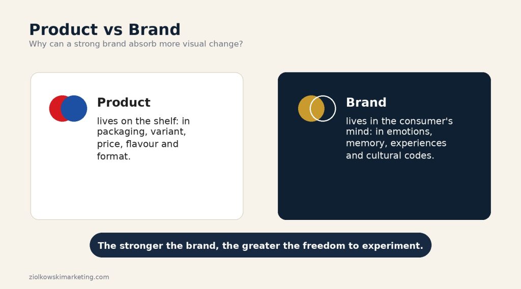
This Is What Separates a Brand from a Product
A product can be changed relatively quickly. A new flavour can be introduced. A zero-sugar variant. A caffeine-free version. A limited edition. A different pack. A new format.
A brand cannot be changed as easily.
A brand lives in the mind of the consumer. It is the sum of associations, experiences, emotions, memories, expectations and cultural codes. Packaging is one of the carriers of the brand, but it is not the whole brand.
That is why a strong brand can absorb more product and visual experimentation. It can enter new consumption occasions. It can test flavour variants. It can even temporarily move away from its core codes, provided it does so consciously and with a clear strategic purpose.
A weaker brand does not have that luxury.
If a brand is recognised mainly by its colour or logo, moving away from those elements can be risky. The consumer may simply fail to notice it. Or fail to understand that it is still the same brand.
Where Does the Risk Begin?
The most interesting strategic question is not: “does it sell?”
In this case, it appears that it does. And measurably so.
The real question is different: do such moves build the brand, or do they slowly use up its brand capital?
Brand equity works a little like a strategic buffer. A strong brand can afford more. But that does not mean it can afford anything.
If a move away from visual codes is linked to a clear strategy, a new consumption occasion and a coherent role for the product within the portfolio, it can strengthen the brand. It shows flexibility and relevance.
But if such decisions are made only to “stand out on shelf”, “do something fresh” or “attract younger consumers”, they may gradually dilute recognition.
The line is thin.
Strong brands do not have to be prisoners of their codes. But they still need to know which codes are fundamental and which can be managed more flexibly.
A Takeaway for Marketers
For me, the Coca-Cola and Pepsi case shows one important thing: visual identity is not brand strategy. It is a tool of brand strategy.
Colour, logo, typography and packaging matter enormously. But their power depends on what has been built underneath: positioning, emotion, brand character, consumption occasions and associations stored in the consumer’s mind.
Weak brands need to protect their codes very carefully, because often they do not have anything stronger.
Strong brands can manage their codes.
But the best brands do it consciously.
Not because “it is time for a new look”.
But because the new look supports a specific strategy.
